Brand GuidelineS
We’re in the business of creating unforgettable event experiences.
An easy ticket purchase process, a sleek mobile app, and engaging onsite activities play a part, but we do so much more than that. Our live event technology and services empower organizers to transform how attendees experience their events and capture more data in the process.
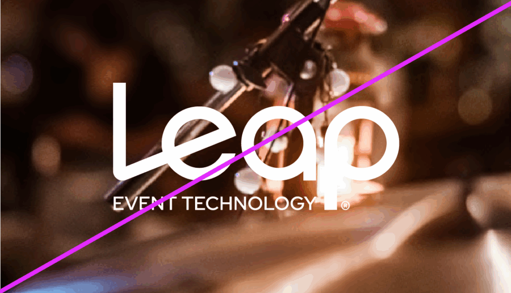
OUR NAME: LEAP EVENT TECHNOLOGY
leap header background image gradient with dotsOur name, Leap Event Technology (or “Leap” for short), promises an elevation from the expected technology and services that pack the events industry. We empower organizers to create events that are more thrilling, more engaging, and more impactful than anything they’ve done before. These exciting experiences fuel the passions of fans all over the world.
Creating events of this caliber takes time, dedication, expertise, and top-notch technology.
That’s why we chose a name that encapsulates all that and more: Leap.
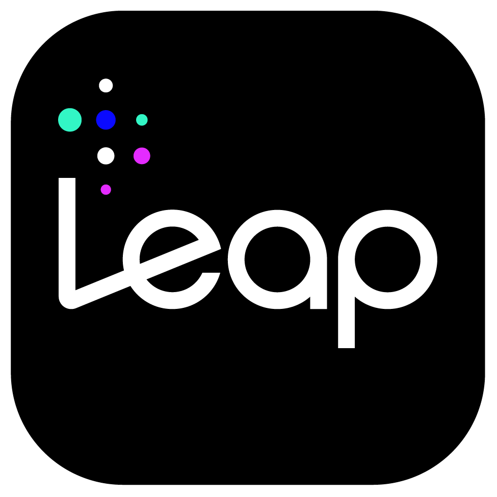
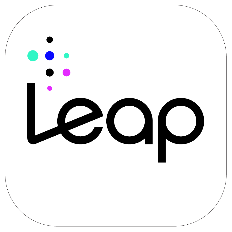
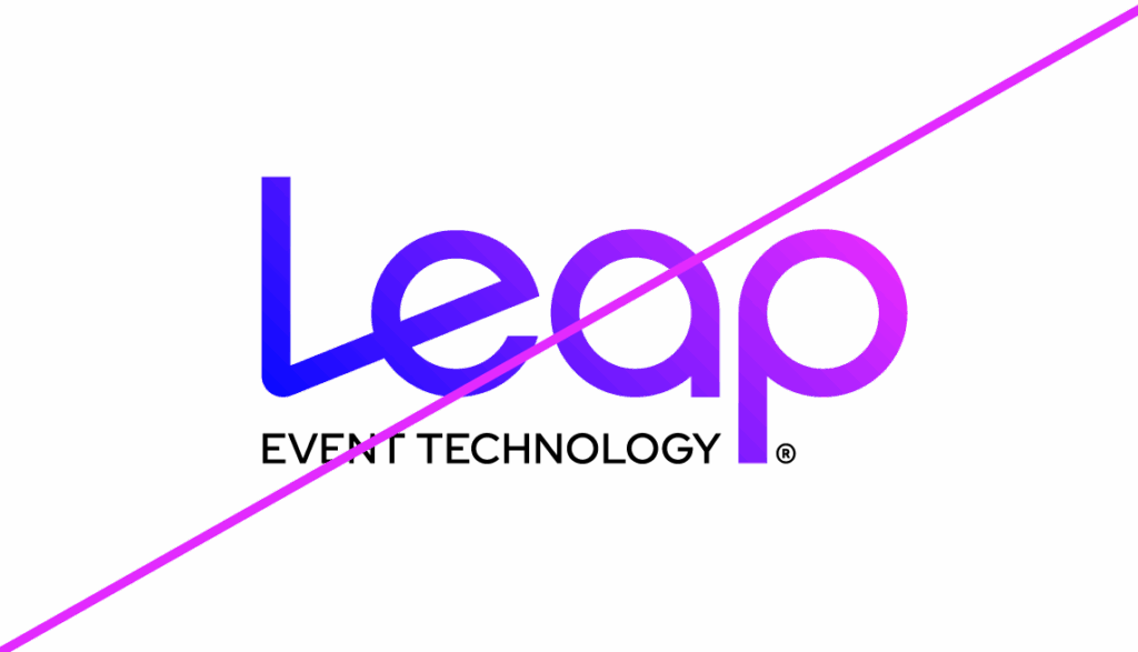
WORDMARK
Our logo is one of the first elements our audience sees, so it was designed to embody who Leap is at a glance. The diagonal slant of the “L” represents our elevation in the events industry and our forward-thinking approach to technology. The modular typeface shows that we are flexible and modern. Our logo can be featured in black or white only.
Logo Guidelines For Small Dimensions
When our logo needs to be sized smaller than 1.25” wide, it’s perfectly fine to use the Leap logo. This logo should never be sized smaller than .5’ wise. This logo can also be used on social graphics and on documents that already feature our full logo.
Favicon
This small tile version of our logo (i.e., a favicon) is ONLY to be used in the following pre-approved circumstances:
- In the browser tab of Leap’s website
- As a small profile image in platforms like Slack
- As an app icon
Since this is NOT our company’s official logo, using this favicon beyond the locations listed above are strictly prohibited. If you have questions regarding the use of our favicon, please contact [email protected].
Clear Space
Clear space refers to the area around the logo that must remain free from copy or graphics to ensure that the logo is not obscured. As the diagram indicates, the minimum clear space surrounding the logo is the same diameter as the letter “e” in “Leap.”
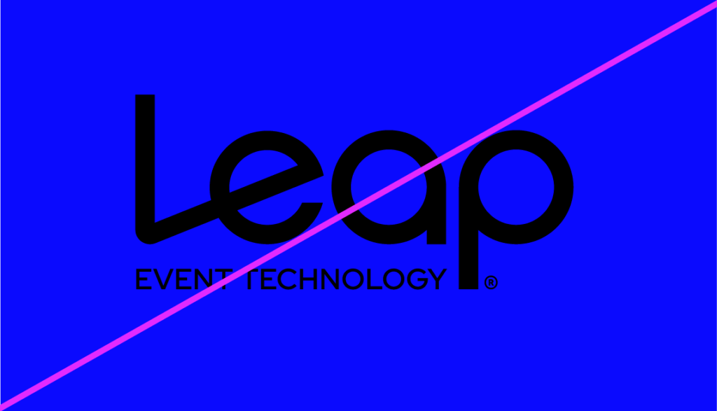
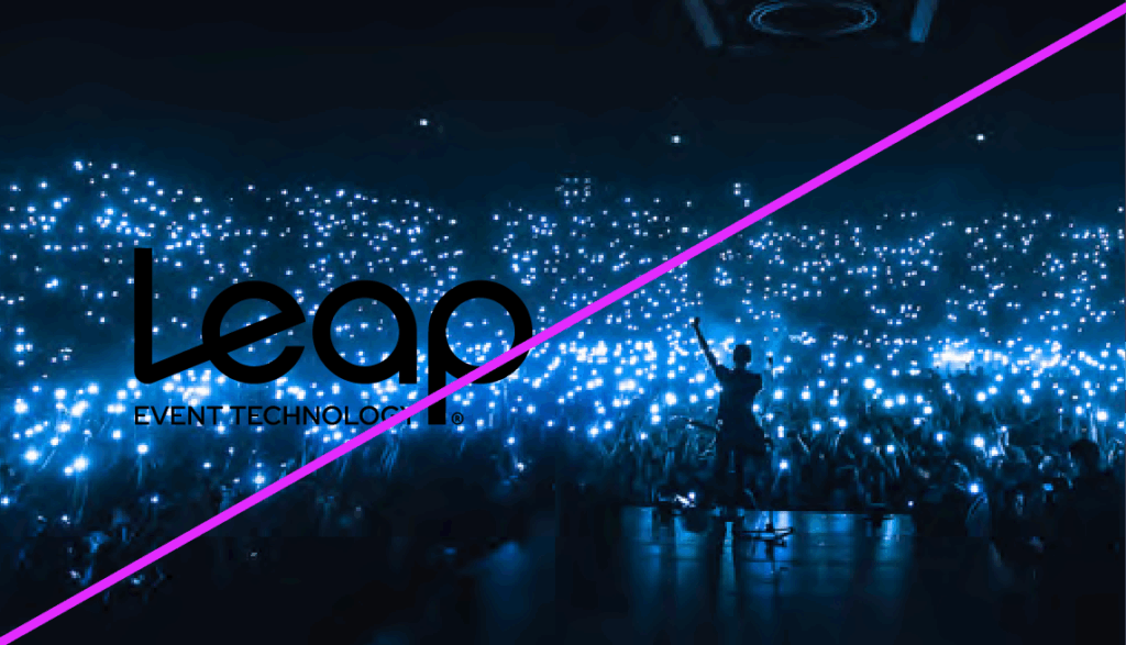
Logo Usage
Do’s
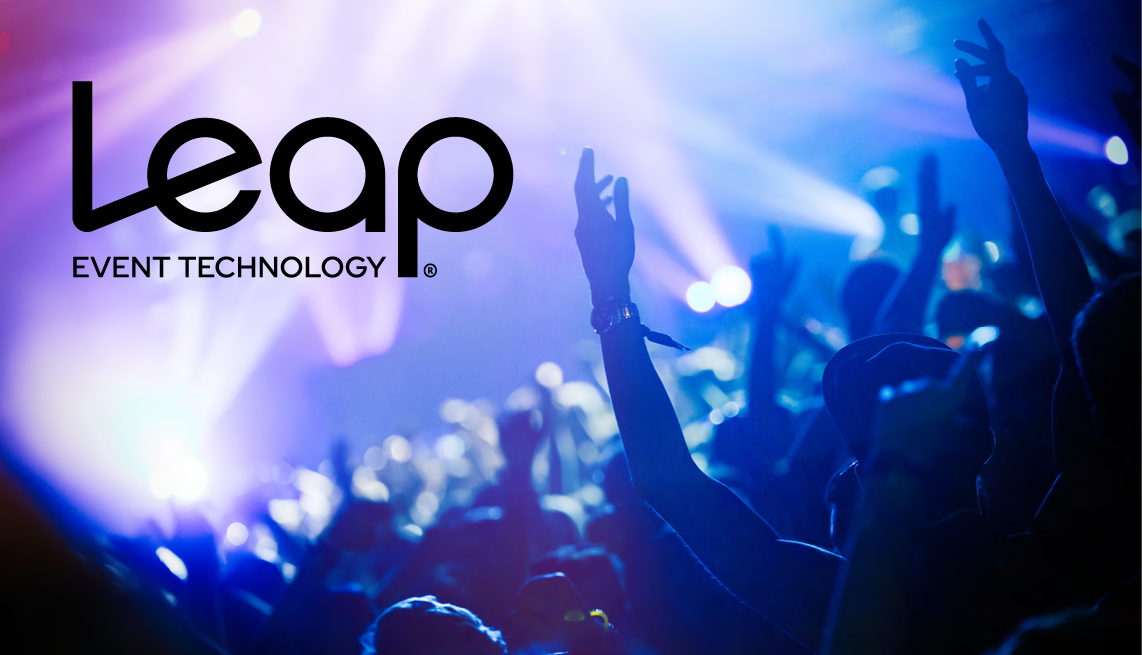
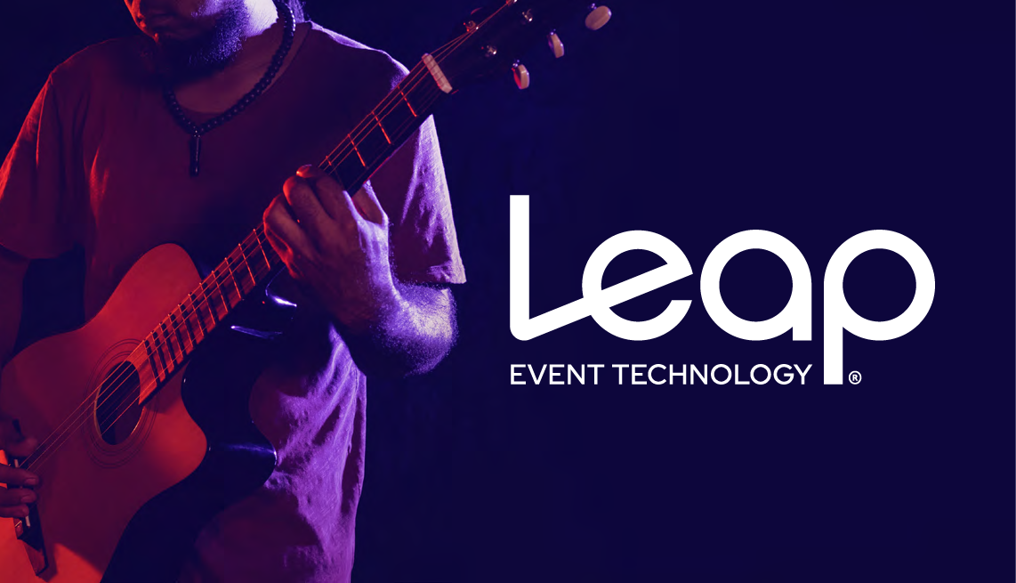
Our logo can be placed over a color background or image as long as it remains easily readable.
The black logo must be placed on a light background where there is a large contrast between the backdrop and the logo. Similarly, the white logo must be placed over a dark background.
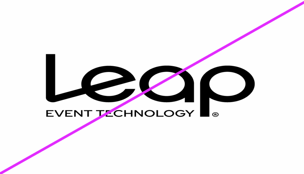
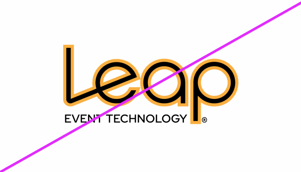
Don’ts
Do not alter our logo in any way. The gallery of images here are examples
of how our logo could be altered or misused that would violate proper
logo usage.
- The logo should NEVER be stretched, squished or skewed.
- The logo should NEVER incorporate an outline or a drop shadow.
- The colors of the logo should NEVER be altered.
- The logo should NEVER be placed on a non-contrasting background.
Typography
Pink orange gradient text mask imageOur brand appears across many different mediums (emails, social media, websites, printed materials, etc.), so we use typefaces that can work in any situation.
Aa
ABCDEFGHIJKLMNPQRSTUVWXYZ
abcdefghijklmnpqrstuvwxyz
1234567890
Red Hat Text
Our primary font, Red Hat Text, is a sans-serif font that is clean, modern, and easy to read. It’s used on all standard print, sales enablement materials, and business collateral, as well as on all of our websites and digital assets.
Red Hat Text is to be used on body copy and text that is 18pt and smaller, where its superior legibility shines at smaller sizes for both digital and print. Below are the approved font weights to use:
Regular
Medium
Bold
Aa
ABCDEFGHIJKLMNPQRSTUVWXYZ
abcdefghijklmnpqrstuvwxyz
1234567890
Red Hat Display
Red Hat Display is our secondary font and is often used for headlines and larger text sizes where its expressive character adds visual impact and hierarchy.
Red Hat Display is to be used on headlines and any text that is larger than 18pt. Below are the approved font weights to use:
Regular
Medium
Bold
Black
Brand Colors
Gradient image for text inlaysOur brand colors convey who Leap is at a glance and guarantee we stand out from the crowd.
Our primary colors, black and white, allow the vibrancy of live events to take center stage. It gives us the flexibility to fit in anywhere.
Our secondary color palette is where our personality really shines. We use vibrant colors to show off our enthusiastic and creative side, and to capture the intensity and thrill of attending live events.
Our preferred colors are formatted for digital use with the listed HEX and RGB codes. In rare instances when print is needed, reference the PMS and CMYK codes.
Primary Colors


Primary Colors
Use brilliant blue as the dominant secondary color; reserve vibrant purple and cool gray for minimal, supporting use only.


Accent Colors
Important Note: Accent colors are to be used ONLY when more colors than our main five colors are not enough. (e.g., charts, graphs, diagrams).


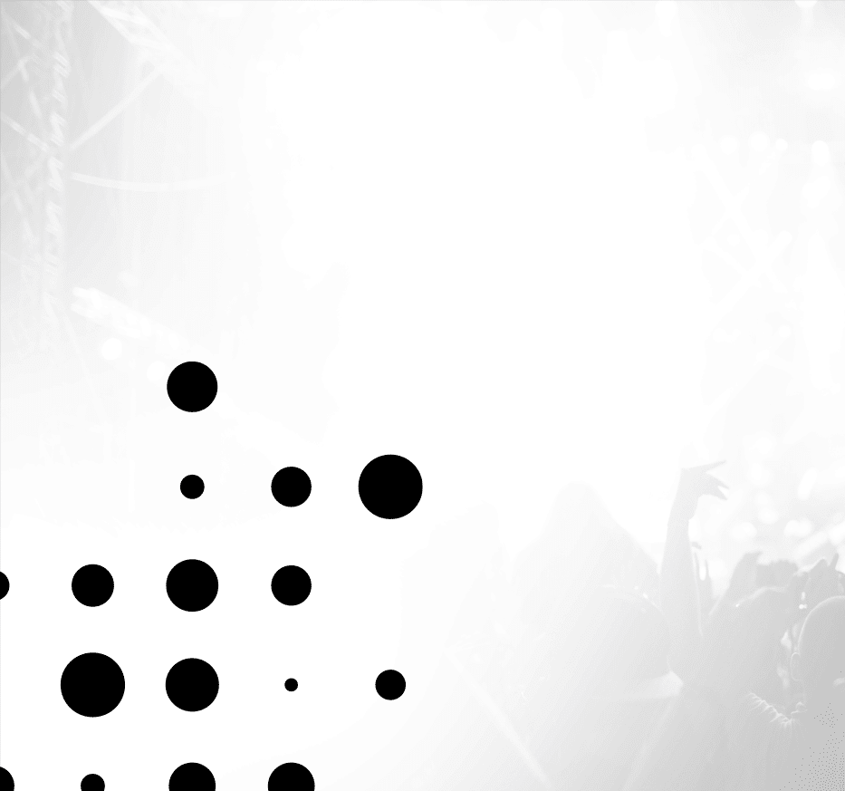
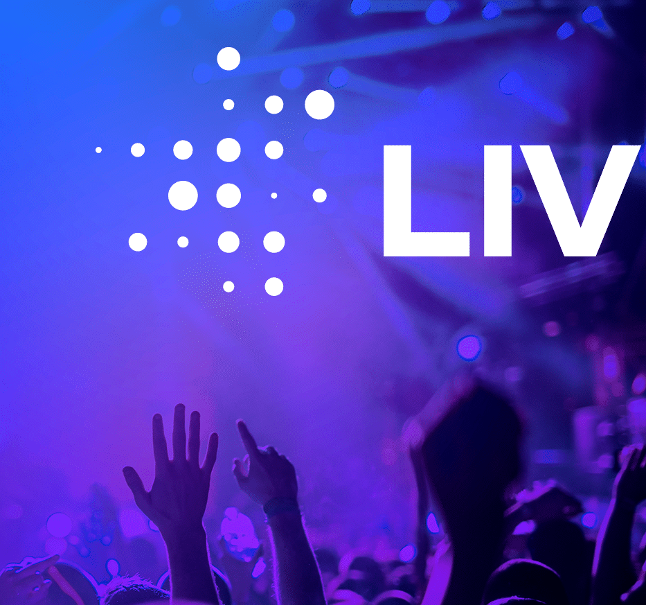
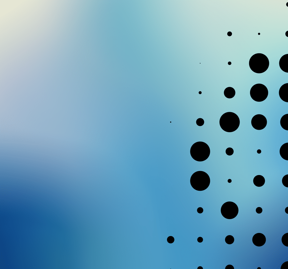
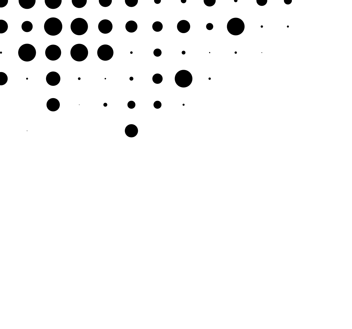
Design Elements
We use a dotted design element in certain instances when a photo can’t be used. This can make any piece of sales material or internal deck come to life, as it adds visual texture (and our unique branding) to an otherwise plain page.
Why a dot pattern? It represents a bright detail of live events. At first glance, the dot pattern is reminiscent of lights at a stadium, a music festival, or a performance venue. And if you take a deeper look, you may even see a seating chart of your favorite theater.
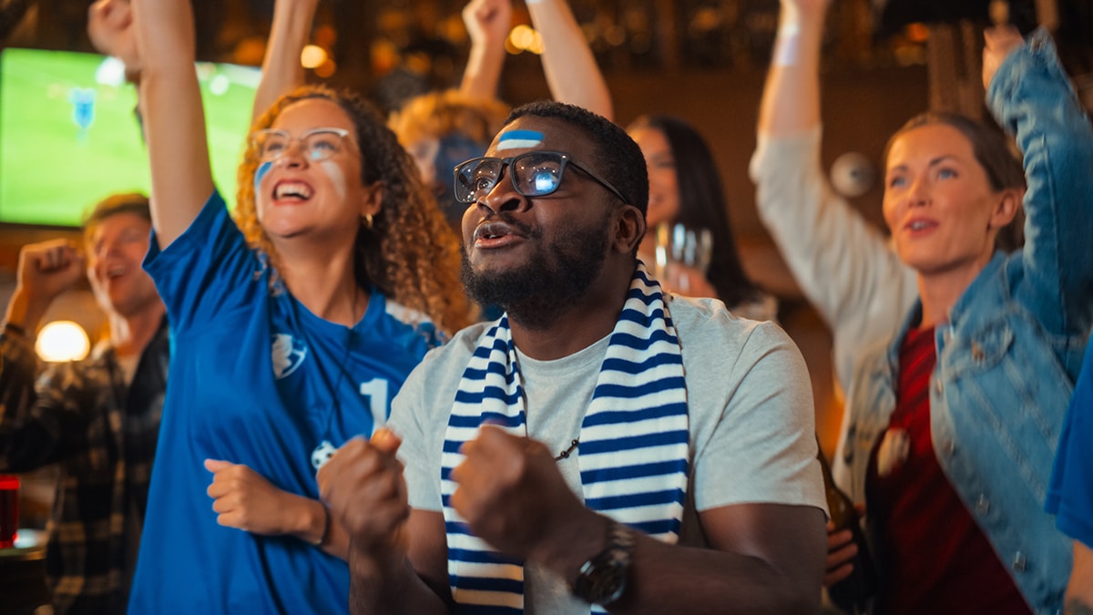
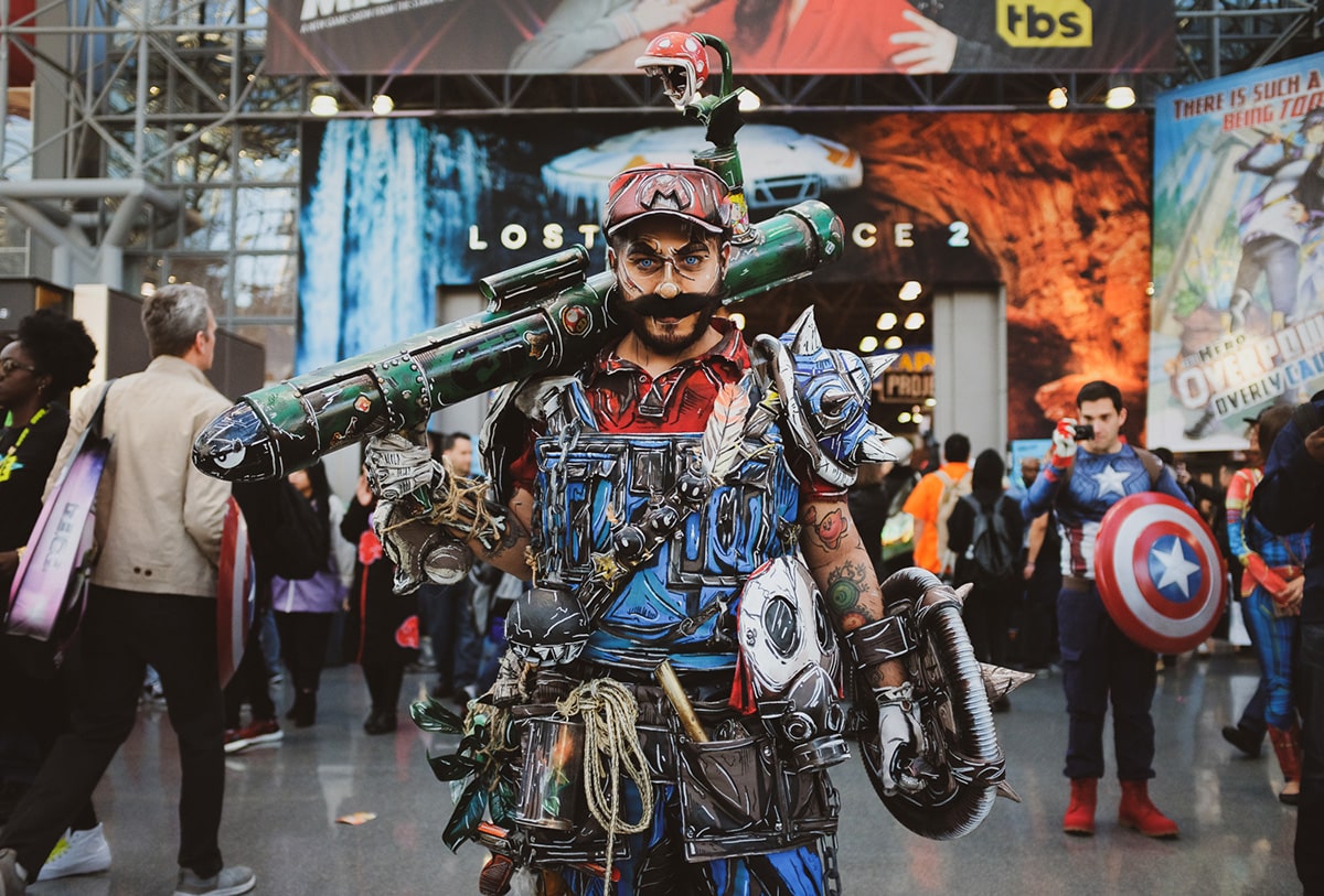
Imagery
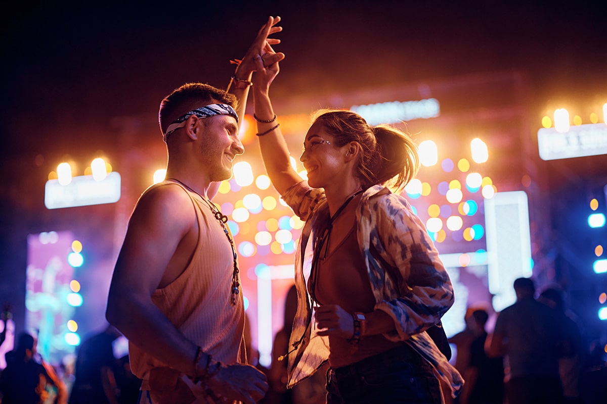
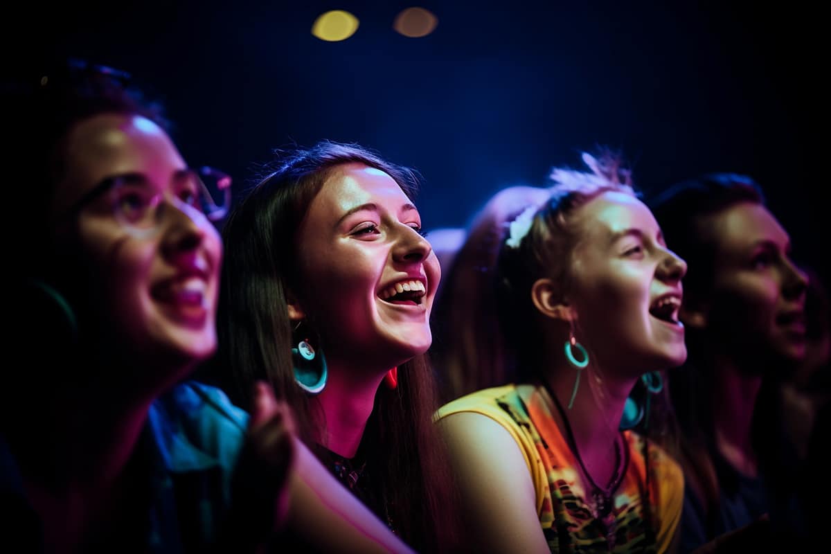
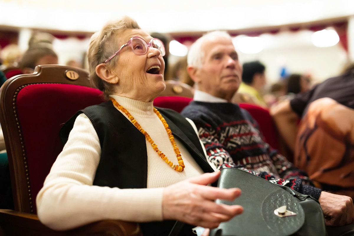
We believe a picture really is worth 1,000 words, so we’ve put together photographical standards that must be followed when using images on any branded asset. Primarily, we want to showcase event-goers having a great time! This includes friends smiling at a pop-up museum, candid photos of families enjoying a festival, or a single attendee dancing to the music.
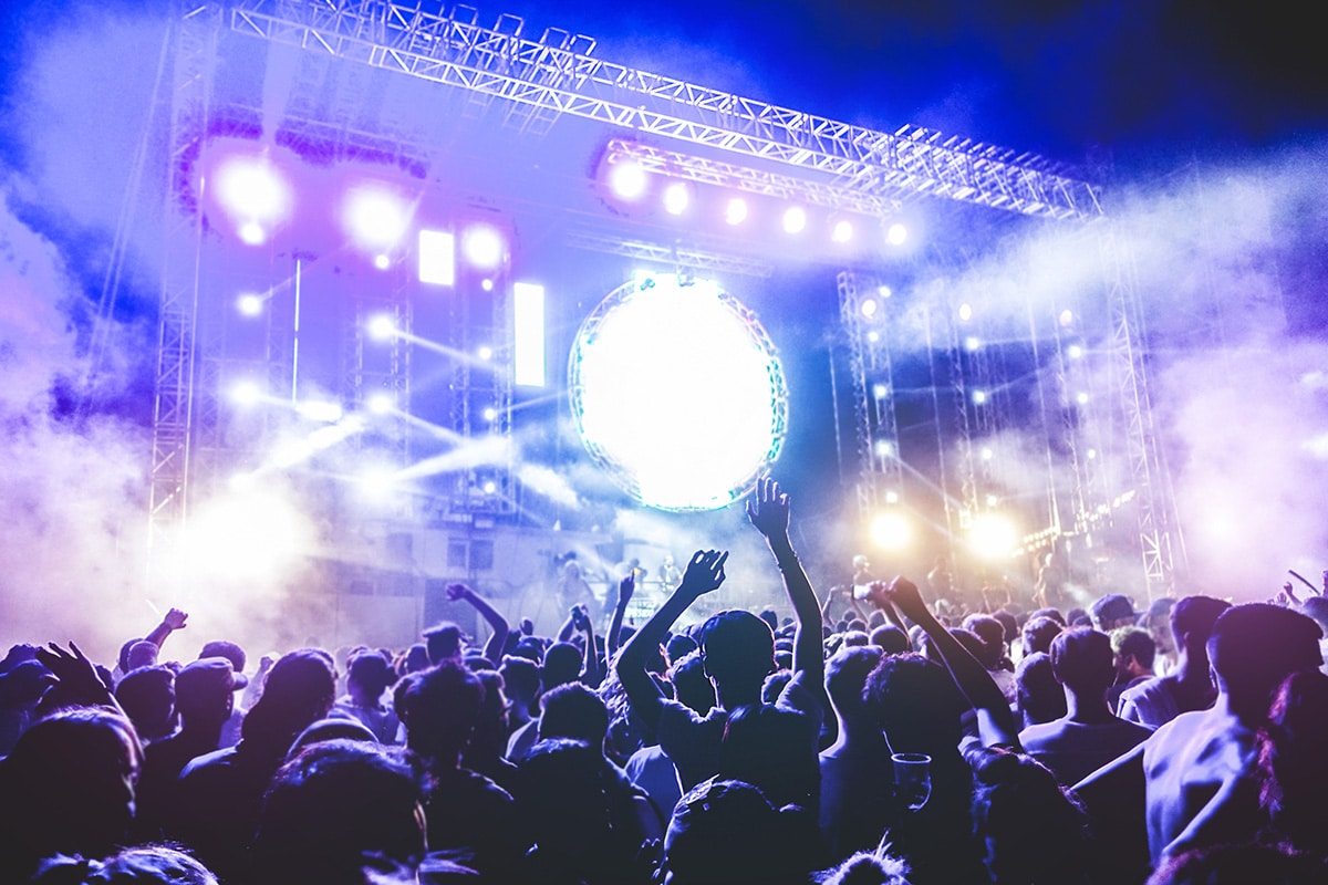
At times, we’ll incorporate other types of event photos. For large-scale events, there’s no better visual than an aerial view of a busy convention hall or a shot of a packed music festival. We’ll also use photos that make our audience feel truly immersed in the experience, like the view of the stage from the crowd. Use brilliant blue as the dominant secondary color; reserve vibrant purple and cool gray for minimal, supporting use only.
Important Note: Accent colors are to be used ONLY when more colors then our main 6 colors are not enough. For example: charts, graphs, diagrams.